1. About
I joined TropoGo as the first designer and helped shape the product from the ground up — from understanding drone users and the ecosystem to designing the products they used to learn, operate and transact.
My role
Research · Product strategy · UX · Brand · Design
Platform
Web · iOS · Android
Designing for a new category
When I joined TropoGo in 2020, drones were still a new category in India.
There was no clear playbook for who our users were, what they needed, or what a drone platform should become.
So I started with the basics:
Understand the ecosystem.
Understand the people.
Find problems worth solving.
This eventually led to a platform covering drone maps, regulations, insurance, training, jobs, tenders, marketplaces and more.
Tools & Platform for Drone Pilots

Tools & platform for enterprise
2. Research
We didn't know our users well enough
Our main users were drone pilots, but they were not a well-understood user group.
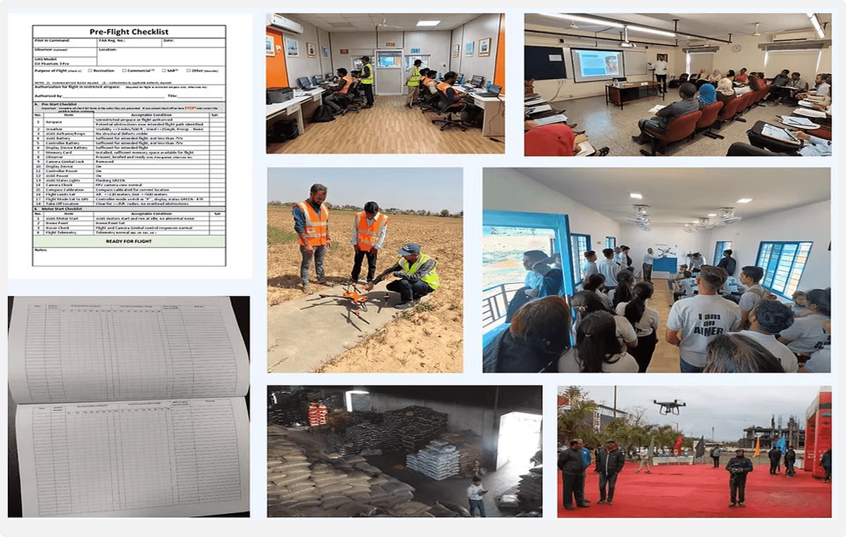
I spent time studying the industry, visiting remote pilot training organisations and drone operations, attending drone events, and speaking to pilots and enterprises.
What we found
The opportunity was bigger than one product
The research showed that pilots had needs at different stages of their journey.

Understand
Regulations, technology and the industry

Operate
Check flying conditions and plan risk free operations

Learn
Get certified and build skills

Grow
Find jobs, businesses and new opportunities
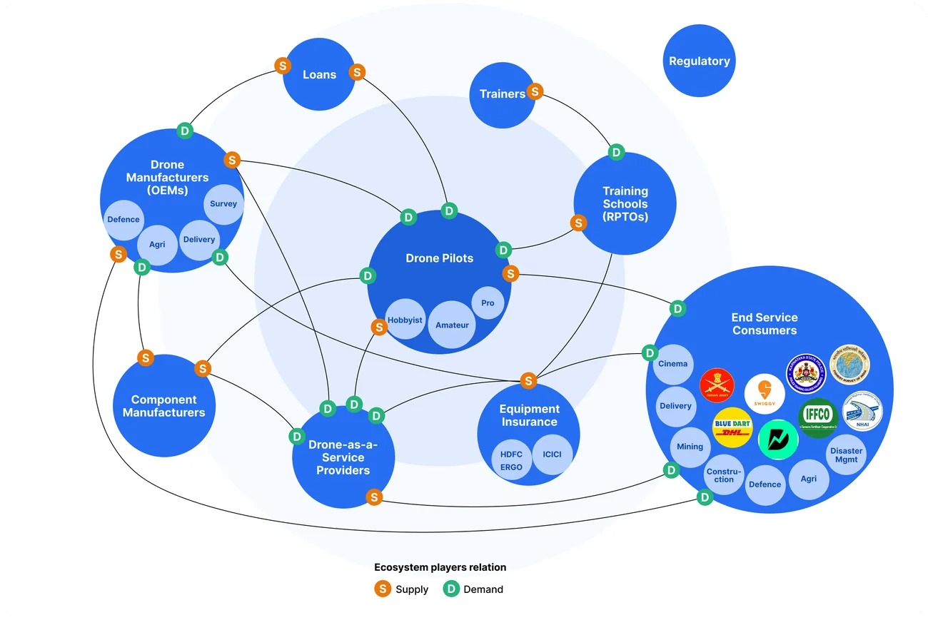
This also helped us understand the larger ecosystem around pilots — OEMs, RPTOs, enterprises, DaaS companies and regulators.
Ecosystem players, relationships & potential business verticals
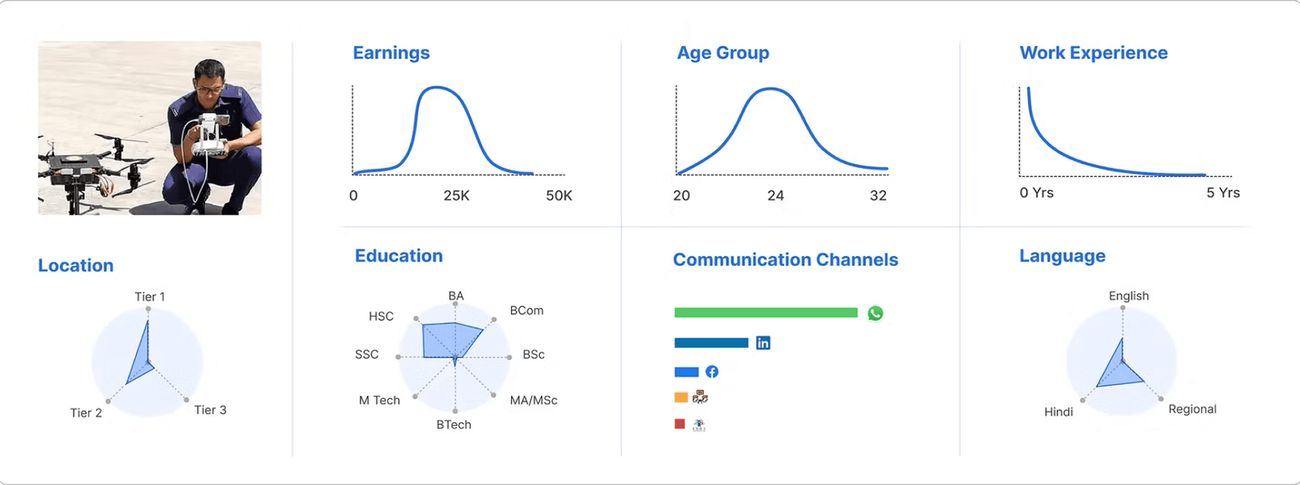
Archetype
Drone Pilots (Amateur, Hobbyists & Professionals)
Defining our key archetype shaped our product direction, business strategy, marketing approach, and brand communication tone.
Amateur drone pilots are newcomers to the industry with little to no experience and may or may not be licensed. Unlike hobbyists, they see drone flying as a potential professional career rather than a recreational activity.
Hobbyist drone pilots fly drones for personal enjoyment, such as taking scenic photos or exploring technology. Their activities are recreational and not focused on earning income or building a professional career.
Professional drone pilots are licensed individuals who use drones for commercial purposes, such as photography, videography, surveying, agriculture, inspections, or deliveries. They possess advanced skills and operate to meet professional and industry standards.
3. Product strategy
We didn't want to ask users to buy something before they had a reason to trust us
So we built the platform around three ideas:
Overarching guiding principles
Defining platform horizons
We had multiple offerings we could introduce on our platform, We chose to start with information products first, then introduce transactional products and finally enhance the platform experience with personalisation as part of our platform horizons.
4. Product journey highlights
Telemetry backed optimisations and implementing platform horizons
Mobile app evolution:
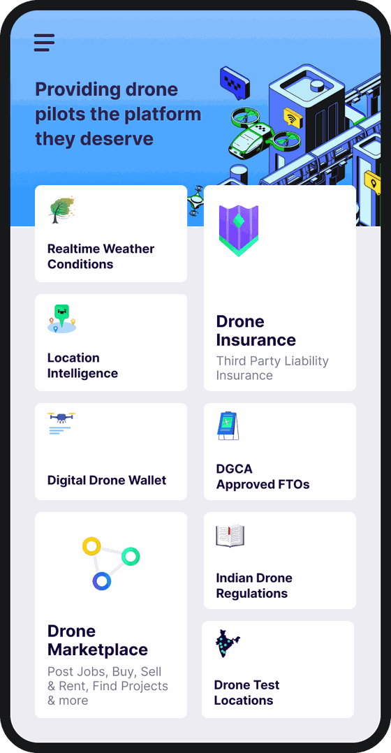
2020
Testing the grounds - Phase 1
To quickly access our hypothesis, we launched the app with a simple design layout to understand the telemetry of usage by the users.
Most of the features introduced were based around information consumption as stated in our phasing strategy to invoke trust for the brand.
Data backed improvements
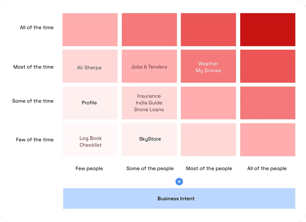
We relied heavily on patterns of our feature consumptions - time spent, most viewed, scroll depth, quick backs, abrupt behaviour to enhance and priortize the tools and features most used by our users
We applied the Red-route method to priortize the features for our pipeline and to communicate the path taken to our stake holders.
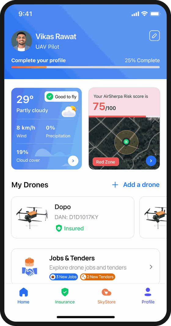
Introducing Transactional Behaviour - Phase 2
Once we had a user base that trusted the brand, we moved from offline sales and introduced online transactions for insurance, drone commerce and training.
Sunset unutilized offerings - a number of features like checklists and logbook were discontinued to keep the app relevant to user needs and light on resources.
2024
Introducing Personalization - Phase 3
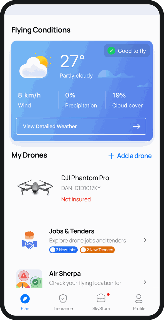
A detail profile was introduced for users to choose their preferences.
Weather services recommendation was updated for the user’s
equipment parameters.
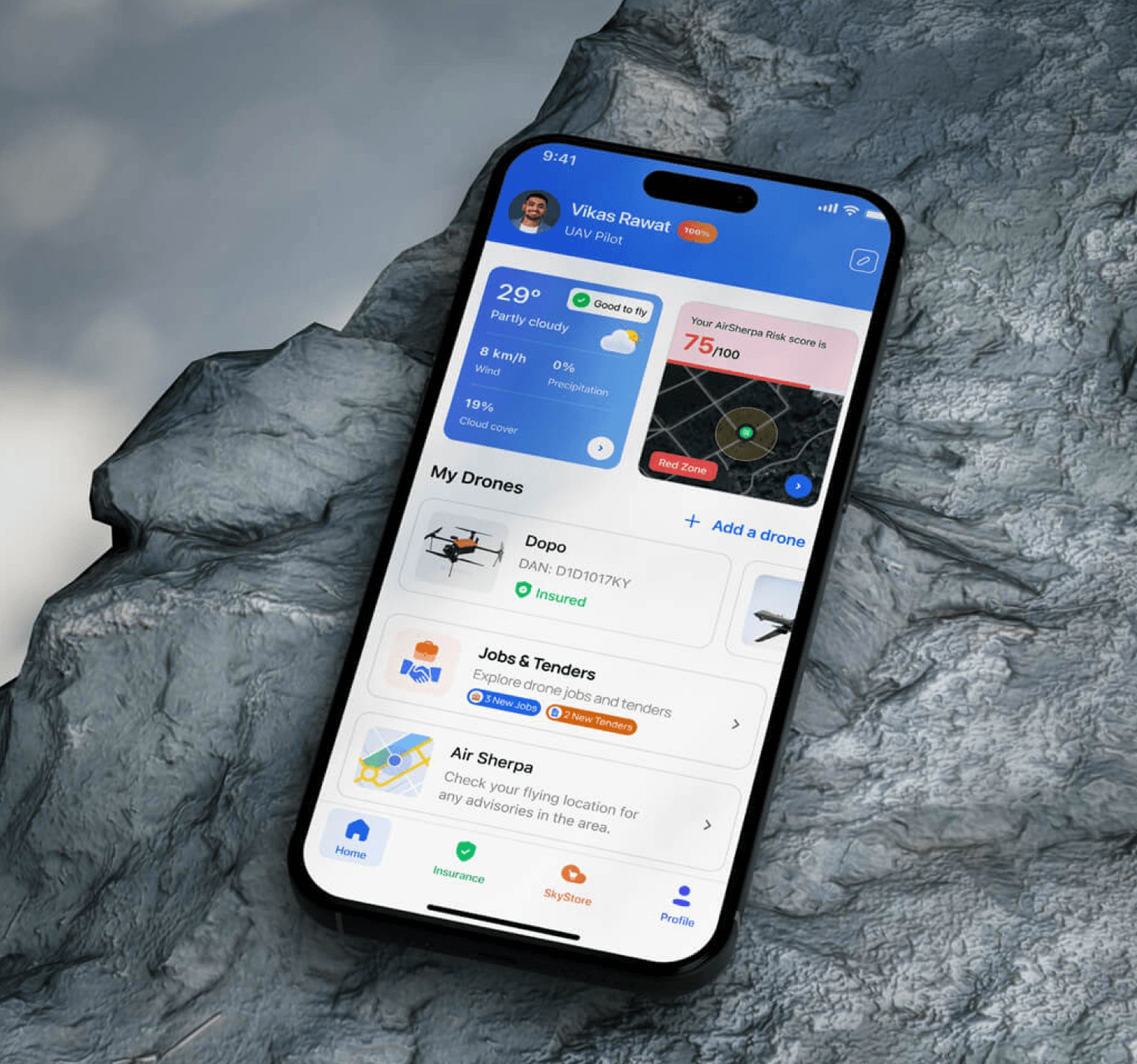
AirSherpa Risk Score was optimized for 1 tap viewing.
Web platform evolution:
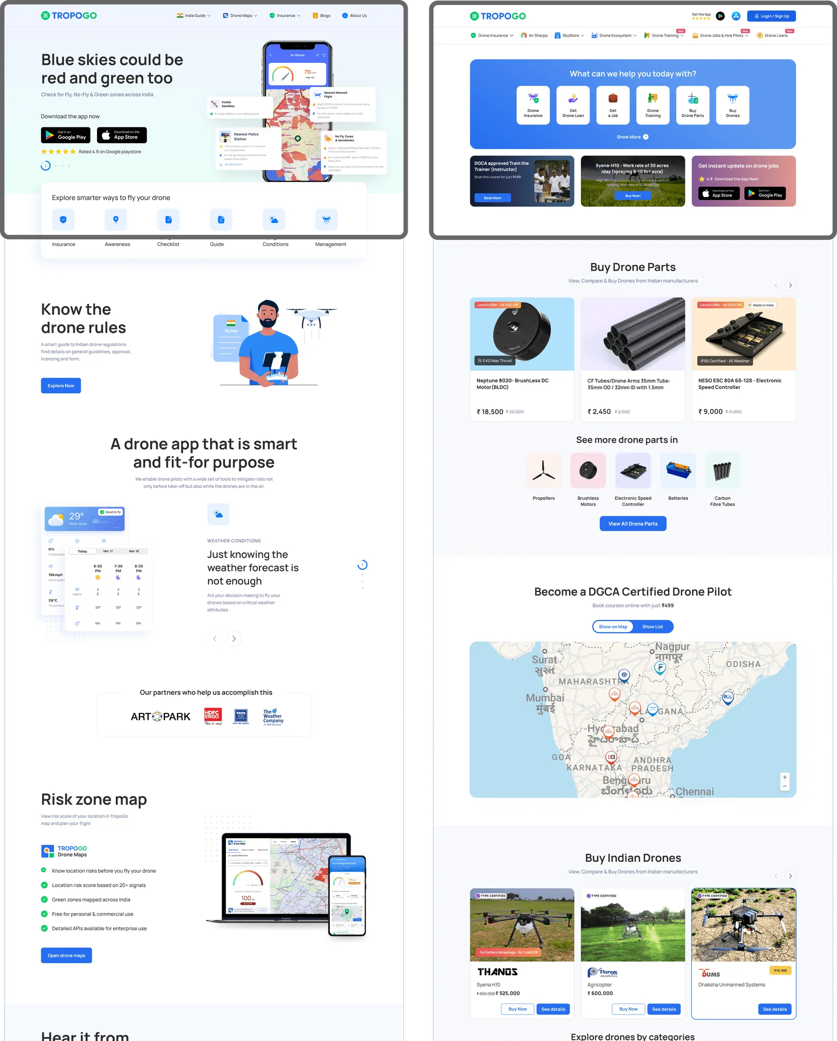
2020 - Phase 1
Focus on value offered to the user
2024 - Phase 2
Personalized Experience
Hover on the hotspots to see how the platform eveolved
AirSherpa Evolution
What is it?
AirSherpa helps the pilot by showing the Air-Space map, potential environmental and physical threats in the flying zone, connectivity in the area, weather conditions and details of nearby government and civic authorities in case of emergencies
Stepped inputs to “Good Defaults”
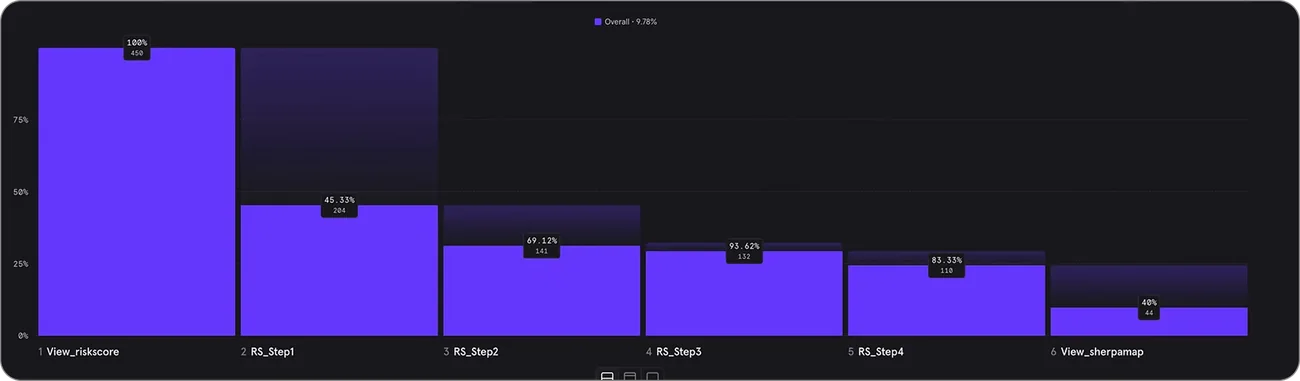
Our initial approach to capture inputs in a stepped manner yielded poor results. Although this was backed by our user interactions and testings, in reality, when we revisited our users, we learned that they require certain spatial information upfront and secondary information on demand.
With this new insight we revamped our approach. A widget was introduced at home page showing the most critical information at glance. The inputs required were changed to default values based on user profile, past flying data and preferences. This helped us achieve, a one click solution where users can further tweak the default inputs for more refined results, but also saved a major section of users from repetitive tasks.
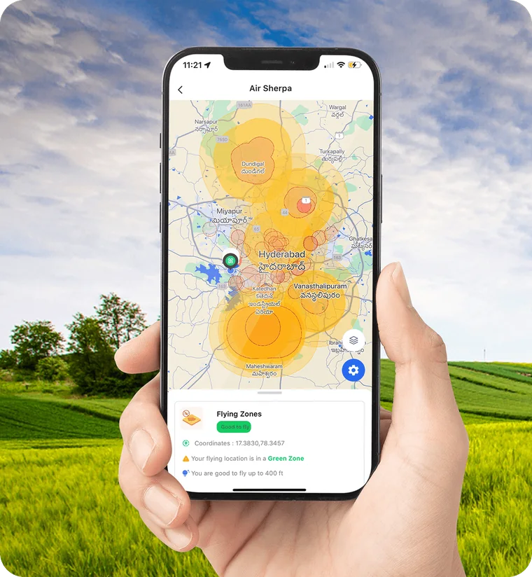
Phase 1

Telemetry results for Phase 1 implementation
Phase 2
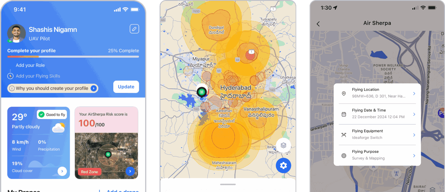
Results
~20× increase in risk checks
Airsherpa search results increased dramatically. Our internal tools captured a ~20x surge in search, ultimately making AirSherpa as the most used product in our platform over the course of 4+ years.
3 Indian Drone OEMs, integrated AirSherpa APIs with their Drone Ground Control Station for pre-flight checks.
5 Remote Training Pilot Organisations, organically included AirSherpa in their training curriculum.
Other data points captured have led to strategic developments in AirTaxi Route mapping, Dynamic Insurance Costs and other potential business ventures.
The lesson
A flow that works in a usability test might not perform same in real world.
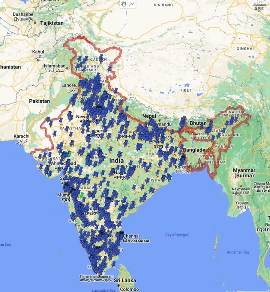
Last 100 days search traffic - Internal dashboard view
Information First Design
In a lot of our qualitative interviews and interactions with our customers, we realized that a lack of information, required or critical in a certain task ( especially with transactional products ) leads to frustration, abandonment or distrust with the brand.
Being a new brand, we wanted to avoid this all costs.
For this we followed a information first design approach, where we made it a practice to make sur that the user is aware or can easily access all the relevant information or requirements related to the product.
We didn't optimise for less information.
We optimised for less uncertainty.
Insurance
The problem wasn't getting users to checkout.
It was getting them comfortable enough to get there.
We found that missing information around coverage, requirements and exclusions could create frustration and distrust. So instead of hiding complexity, we made it easier to understand.
The goal was simple:
Don't make the user guess.
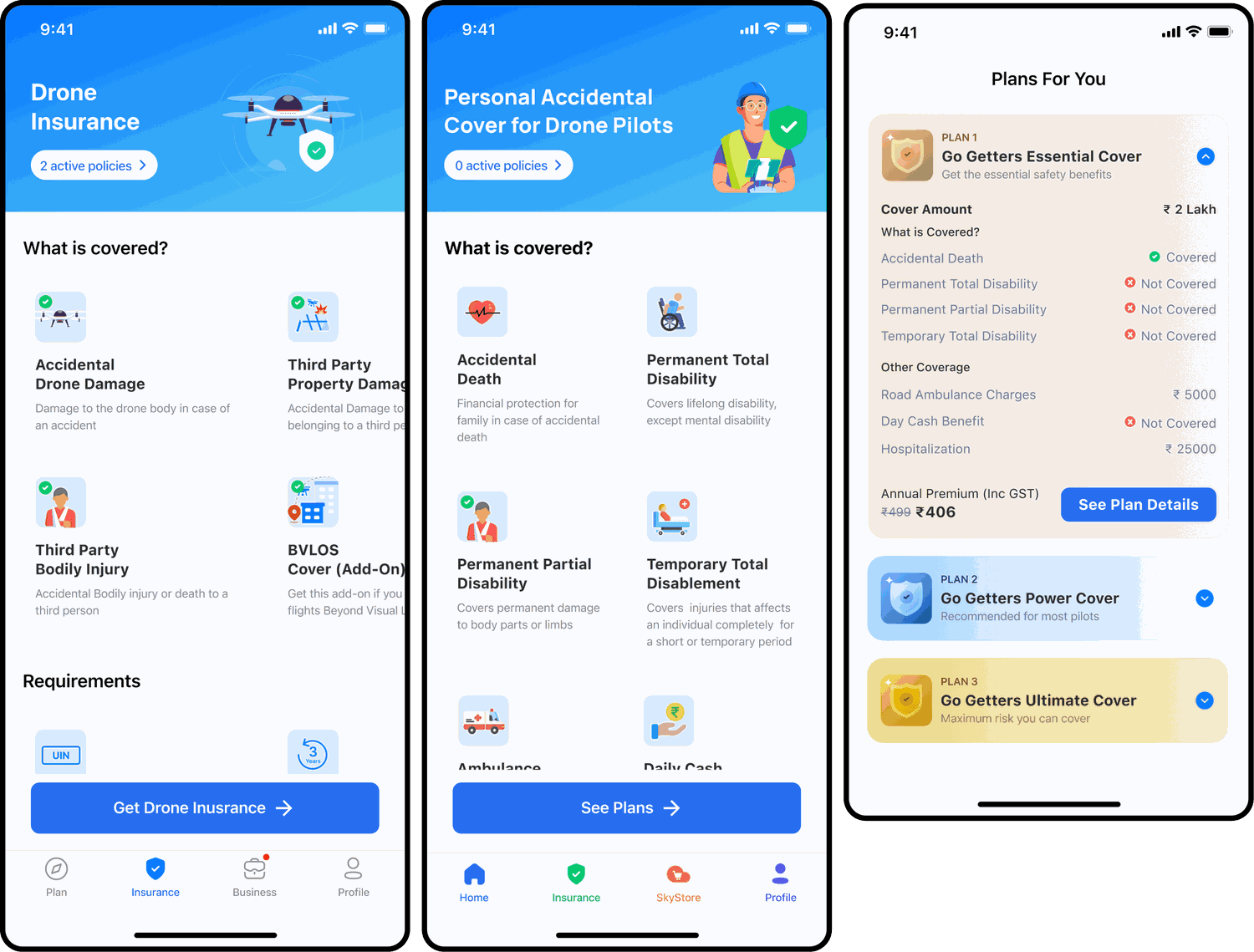
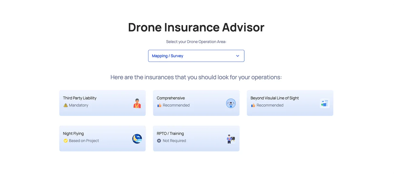
Drone insurance Advisor
Help users choose, don't just make them choose
We built an insurance advisor around the user's actual drone operation.
Users could tell us how they used their drone and get a simpler recommendation.
India Guide
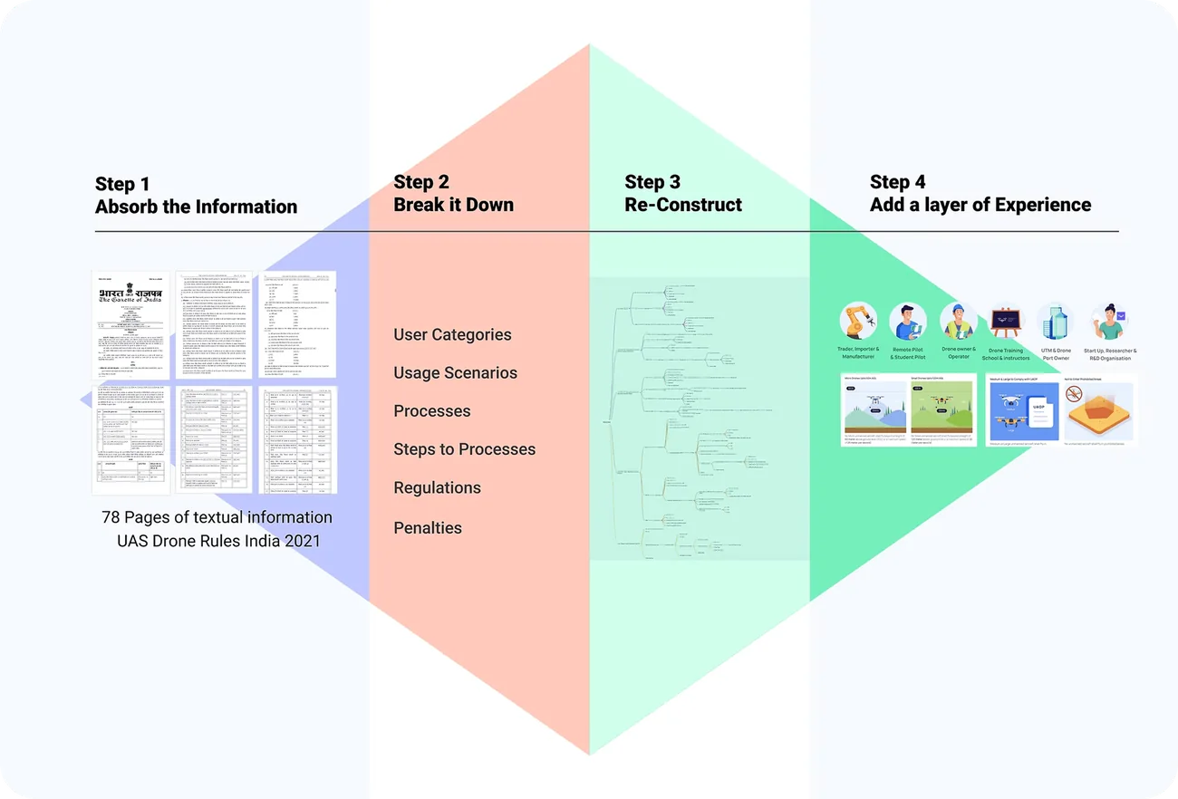
In the initial stages, the Drone ecosystem was growing rapidly, filled with a lot of ambiguity, questions and confusions. For this we created an internal documentation, to help us navigate the day to day scenarios and have a better understanding of the regulations.
Over the course of period, through our customer support and user interactions, we realised that our uses also face the similar challenge of comprehending hundreds of pages of PDFs to understand the regulations.
This led to the creation of the India Guide, the experience was structured around how people actually looked for information.
We organised regulations into simpler categories, used visual explanations where possible, and made the experience easier to scan and navigate.
The product also had to work as regulations changed.
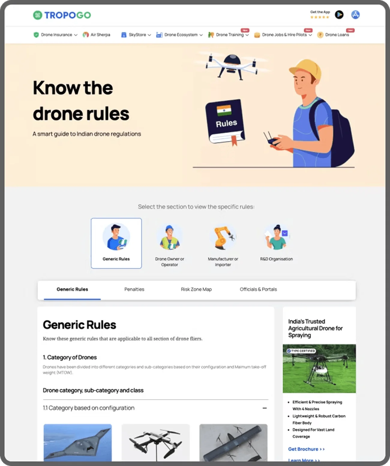
Snapshot of India guide
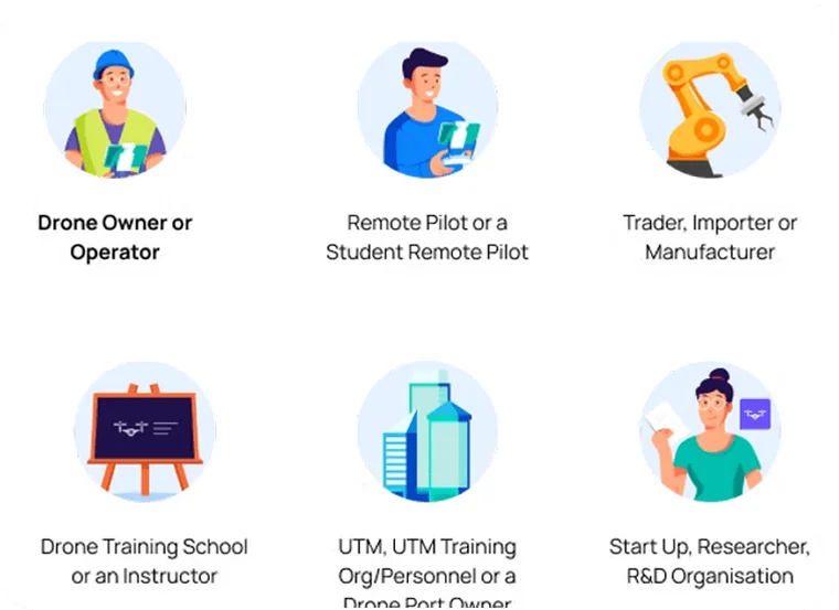
Easy to follow categorization of user groups and rules
Intuitive categorization of user groups and associated rules, making it easy to understand the diverse regulations for each player in the drone ecosystem. This approach streamlines navigation and ensures that users can quickly access relevant guidelines based on their role, whether they are drone owners, operators, or others.
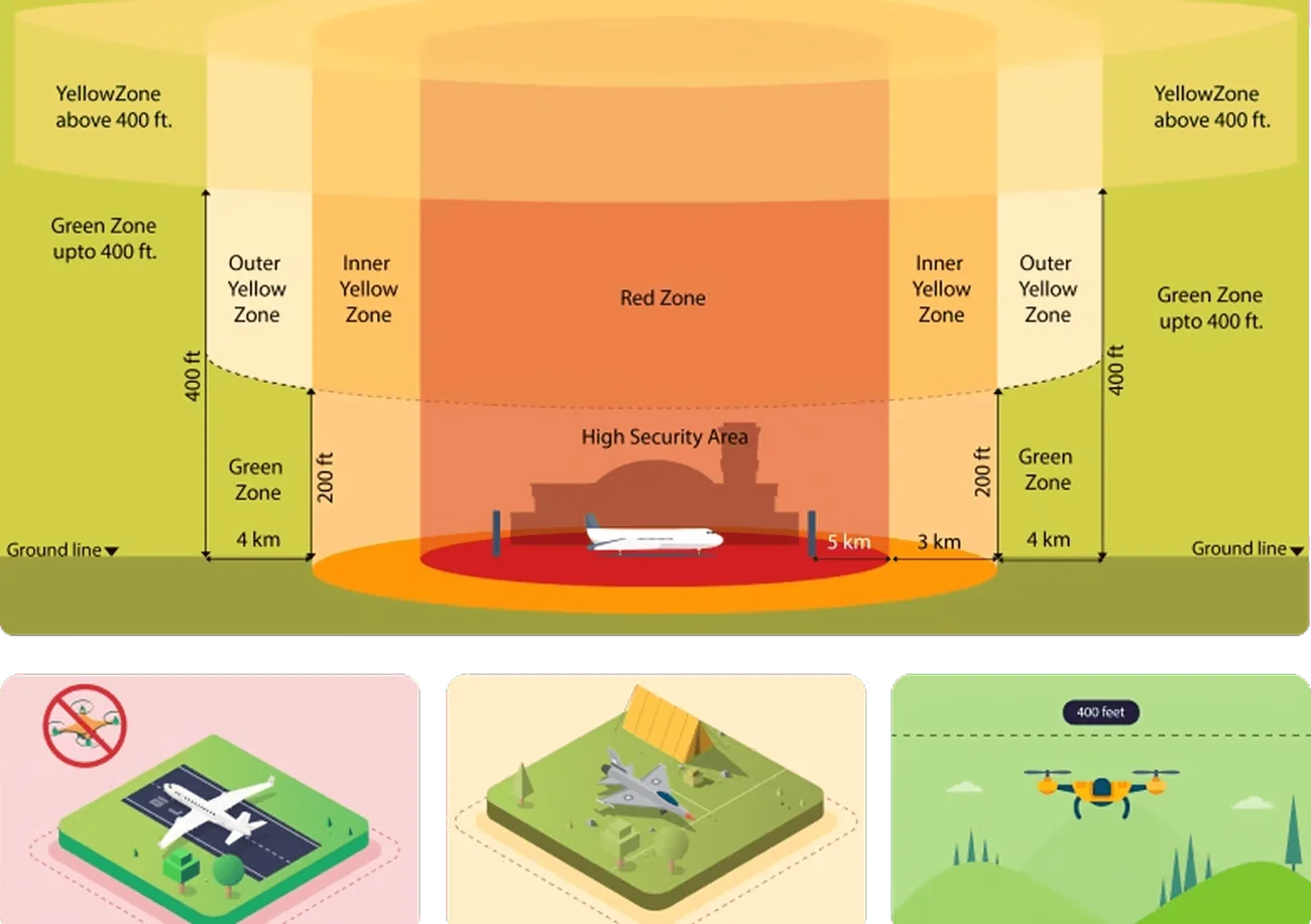
Simplifying Complex Rules Through Visual Clarity
The visual representation of complex rules simplifies understanding by using infographics. This approach makes the regulations more accessible and memorable, helping users easily grasp and recall important details.
Designing for trust
Trust isn't just a UI problem.
We were a new company in a new category. We knew users would face problems we hadn't seen before, especially around transactions and support. So for critical issues, we chose human support over chatbots.
Sometimes the best interface is a person.
We also worked on:
Reducing resolution time
No support email trails, we wanted to resolve our customer's pain ASAP and on the channels they were already present
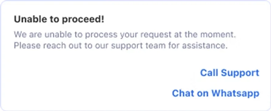
The experience had to build trust even when something went wrong.
Bringing in transparency
Make important statuses and information clear.